|
|


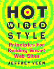
If I was slow to read Jeffrey Veen's Hot Wired Style: Principles for Building Smart Web Sites, my tardiness may in part be excused by the title. The Wired style is so well known, so idiosyncratic, and so recognizable, that a style guide seems almost redundant.

Fortunately, the title is wrong. This isn't a style guide, it's an expanded case study: a description of the philosophy and implementation decisions that underlie a popular and ever-changing family of Web sites.
The chapter headings break down into a list of exhortations that might appear in any Web design manual:
- Embrace the medium
- Know your [HTML] code
- Degrade gracefully
- Subvert hierarchy
- Master hypertext
- ...etc.
Though this is all good advice, none of it is especially new. Surprisingly little of the discussion is tied to HotWired's distinctive visual style, which Veen often treats as an expression of branding and identity rather than a high-design manifesto.
The details, however, are interesting indeed. Veen shows, for example, many generations of the design of HotWired's cover page, describing for each version the problems it was meant to address and the debates that surrounded its release. This is valuable data, and makes a fascinating companion-piece to the well-known usability studies of Sun's Web site.
Unfortunately, Hot Wired Style sometimes loses its nerve (and its details) just when things start to get interesting. Veen exhorts webmasters to study their logs, but doesn't say much about how logs might be studied; the research literature on the subject is very thin, and guidance from practice might be instructive. We see each iteration of the home page in detail, but we're left with vague generalizations regarding the success of each page. The book provides many concrete examples but little hard data: who viewed these pages? How did they behave? What did they buy? Did design changes affect click-through and navigational practice as designers had expected? The data may be hard to analyze, but they are data -- every bit as real and as important as screen layouts.
Veen's chapters on structure ("Subvert Hierarchy") and on linking ("Master Hypertext") are valuable, if elementary. Veen finds the centrifugal force of links alarming, and deplores the way blue links add unwanted emphasis. His discussion of link anchors is good, especially a sidebar where he describes how moving position of a link in a sentence can change the link's meaning:
The crowd scrutinized the candidate's comments.
The crowd scrutinized the candidate's comments.
The crowd scrutinized the candidate's comments.
He urges designers to link with care:
"Be careful with hypertext. Those blue scars scattered on today's Web pages wield an amazing power but are dangerous in the hands of the inexperienced designer. They are a visual challenge, filling carefully designed pages with clutter and distraction, pulling at your reader's attention. And without even realizing it, you're leading people away from your site after you've worked so hard to get them there.
....
Don't distract your readers with links. Use links to enhance your message,
both visually and conceptually, adding depth and dynamism to static pages."
Hypertext researchers will find Veen's caution reminiscent of the early years,
when the Navigation Problem seemed real and threatening:
"Several researchers are working on new representations of hypertext
link structures....but limiting the links in the first place seems
like a more practical solution."
-- Robert J. Glushko, Hypertext 89 Proceedings, p. 51
In time, as links become more familiar, as writers and readers come to recognize patterns of linkage, Web designers will feel free to adopt a more fluent, richly-linked style just as writers of stand-alone hypertexts have gradually moved from rigid simplicity to more organic link styles. (See, for example, Kolb's Socrates in the Labyrinth or Landow's Writing at the Edge, and compare them to Landow's earlier and more hierarchical The Dickens Web.)
Veen's most valuable and interesting insight, however, is his advocacy of non-design. HotWired, after all, is noted for its eye-jarring background colors and cryptic icons, both chosen in defiance of the conventions of usability. In place of the expected hip polemic, however, Veen urges the reader to follow the spirit of the medium, to forswear visual design effects in favor of working within the spirit of HTML. Where Siegel's Killer Web Sites, for example, urges designers to prototype in Photoshop and to use strange HTML hacks in order to get a desired layout, Veen urges designers to find designs that flow naturally from HTML, that browsers naturally express and that applications (agents, robots, search engines) can easily use. This aesthetic is challenging but also forgiving; it can encompass minimalist Web sites like scripting news and usable web as easily as Fray and HotWired. In today's fragmented Web world, any tent that big is worth a peek.
FREE! Subscribe to the Eastgate-List, our moderated electronic mail list for
hypertext news and announcements.

|


