compressing images
Web design guides are filled with tips on "image compression" -- ways of making image files smaller so that web pages download quickly and use less storage.
Akscyn's Law suggests that web pages should download in about 1/4 second.
The guides are full of tips on choosing colors and using various compression methods; what they often overlook is that smaller, simpler pictures may best serve the writer's purpose.
 Let's sit here for a moment and talk about images. Big, photorealistic images have impact. They dominate the screen. They also dominate the reader's attention and imagination.
Images in a hypertext work best when image and writing carry distinct (or interrelated) messages, not when the image merely repeats the text. If the picture is not the entire message, if what you want to say is not expressed completely by the picture, the impact of too large or compelling a picture may overwhelm your writing. 
Although we experience photorealistic images as real, their realness may not translate into engagement. Much of our experience, though real, is tedious, plain, unremarkable. Stylized, provocative images mean more than snapshots.
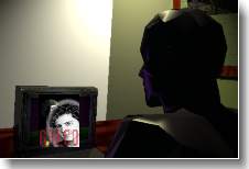
 Consider this poster, from Eastgate's author index. Would it be better if it were bigger, more detailed, more colorful? How about if it were full-motion video? The message, after all, is not to help readers identify Professor Kolb in case they meet him in a restaurant and want his autograph. This picture is meant only to convey some sense of the author's personality, his humanity; a simpler image may tell us more of what we really want to know than would a picture that is more real.

Scott McCloud, in his indispensable Understanding Comics (Harper, 1993), points out that realism inhibits our ability to identify with a character. We perceive realistic faces and bodies as belonging to others -- after all, that's the way other people look. We perceive ourselves through symbol and icon. David Mamet, in Writing In Restaurants, makes a parallel argument in discussing the playwright's craft. Beginning playwrights, he notes, write detailed stage directions because the dramatic action is insufficiently real -- that is, because actors and audience don't identify strongly with it. Successful drama needs no stage directions: we identify so strongly that we know what must be done. Excess business, like excess scenery, distracts and distances us.
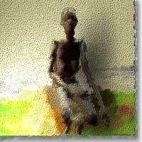
 By making images smaller, more emotional, and less abstract, we bring them into better balance with writing. We also use bandwidth (and the reader's time) more efficiently. A photorealistic 640x480 full-color image can easily require megabytes of storage; none of the images on this page exceed one hundredth of that size. Smaller and more abstract images also keep the hypertext in human scale, helping writers avoid the necessity and burden of investors, producers, directors, and distributors.
Image compression, like good writing, requires saying much in a small space.
